The 5 Biggest Mistakes of Postcard Design – for Direct Mail Retargeting and Acquisition
Direct Mail isn’t making a comeback – it is ALREADY BACK.
Not only did Direct Mail volume jump 28% in 2021, but it’s rising again in 2022 and the forecasters don’t see that changing any time soon.
And your brand needs to be a part of it.
“Why?”, you ask.
Because customers are demanding that their brands treat them well or they’ll take their wallet elsewhere – and 75% are already overwhelmed by their daily DIGITAL exposure.
Their email inboxes are exploding, and they’re becoming numb (and blind) to online ads.
Brands need to find OFFLINE ways to diversify their marketing and advertising outreach, and give customers what they want – a brand experience OUTSIDE of their computer screens.
Give them modern, personalized and relevant Direct Mail.
It will be well received.
MILLENNIALS MOVE MARKETS
Because Millennials are actually driving the resurgence in Direct Mail. And as the largest consumer cohort for the next 20 years, that fact speaks volumes.
Millennials LIKE getting Direct Mail, make PURCHASES online after receiving it, and think it makes for a more PERSONAL approach.
But that doesn’t mean you can just slap ANY design and message on a Direct Mail Postcard and expect it to auto-magically generate new customers.
There are Direct Mail design best practices that have to be followed for greatest impact and response – just as with digital advertising, email and web design.
The massive growth in “trigger-based” Direct Mail has brought in many brands new to Direct Mail – most from Direct Mail Retargeting programs that send customized Postcards to website visitors who don’t convert.
The small- to medium-side formats used in Direct Mail Retargeting require you to be on top of your Direct Mail design game – to enjoy the outsized ROI that these programs can bring.
We’ve developed the 5 Biggest Mistakes of Postcard Design to help brands avoid response-crushing mistakes – because knowing what NOT to do first is usually a faster path to success.
And if you stick around to the end, we have a BONUS download that you’ll want for sure.

The 5 Biggest Mistakes of Direct Mail Design
The 5 Biggest Mistakes were developed from working with brands on thousands of Direct Mail Retargeting programs and Customer Acquisition campaigns over 20 years, but they can help any brand create effective designs for most any type of Direct Mail campaign.
Creating an effective Direct Mail design is so core to our model for Direct Mail Retargeting that it is Fundamental #4 in our proprietary Modern iO Direct Mail Retargeting program.
First let’s quickly review what Direct Mail Retargeting is and how it works – so the 5 Biggest Mistakes make sense.
Direct Mail Retargeting Review
Direct Mail Retargeting works very similarly to digital retargeting. But instead of displaying digital ads, Direct Mail Retargeting sends customized Postcards by First-Class Mail to those visitors who leave your site without converting or opting in.

…to deliver a personal, real-world touch to your visitors as a direct response to their online activity, and persuades them to return to your site and convert.
This is not a branding vehicle. Its objective is to move the past website visitor to return to the site and convert – whether that’s to download a PDF, call to schedule a consultation, purchase a product online, etc.
Now let’s tackle the 5 Biggest Mistakes of Postcard Design… so you never make them!
Postcard Design Mistake #1 – Failing to Plan First
It’s so easy to approach a Postcard design by just rolling up your sleeves and starting to design and lay out your graphical elements and copy on the Postcard. But the core design is influenced by a few fundamental factors that aren’t the actual design elements themselves…
…and they need to be considered first, or you’ll end up with a Postcard design that misses the mark and wastes your opportunity to connect with and convert new customers.
First, you must consider your AUDIENCE who you’re designing the Direct Mail piece for.

With Direct Mail Retargeting programs, you want to have different Postcard designs based on the most valuable segments of your audience – whose activity on your website shows they have the intent to become customers, and are worthy of being sent a Retargeting Postcard.
One segment could include people who visited one of your key Product Pages X, Y or Z, while another segment could be people who visited all three Product Pages X, Y and Z, and another still could be if they abandoned their cart…
…each Postcard having a different design and certainly entirely different messaging that speaks to the behavior and needs of each segment’s members.
Then once you know your audience, the other big consideration is what the OBJECTIVE is for each Postcard – what do you want to get out of those segments? To schedule a bunch of 60-minute appointments, attend an online webinar, or drive the abandoned carts back to your site with a special 14-day Discount Code to complete their purchase?
Planning for the implementation of a Discount Code along with a distinct abandoned cart design are considerations that, if overlooked, could kill your conversions.
So always PLAN FIRST to avoid expensive mistakes.
Postcard Design Mistake #2 – Ignoring the Stage of Awareness
Not properly integrating your website visitor’s Stages of Awareness into your marketing campaigns may just be the number one reason why they fail.
The Stages of Awareness were created by real “Mad Men” copywriter Eugene Schwartz and revealed in his 1966 classic book Breakthrough Advertising.
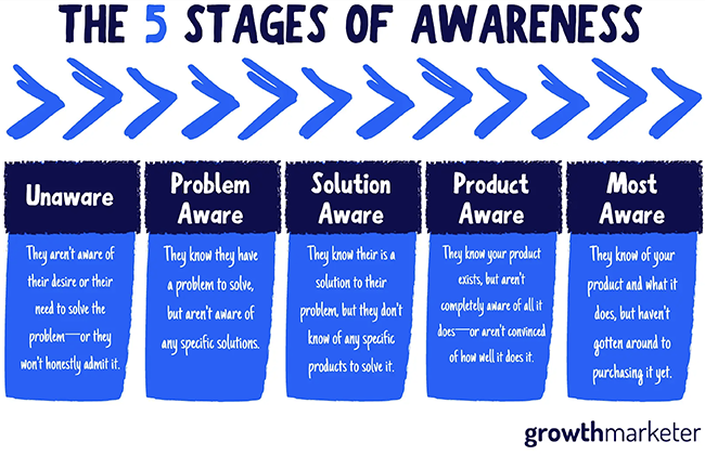
There are five distinct stages – and think of these stages like a sales funnel. Each phase represents a buyer awareness level and is separated from the next by a psychological barrier. As a seller, your job is to bridge the gap with your content and messaging to move the prospect forward — or no sale happens.
It’s founded on the principle that you can’t make a prospect buy before they feel ready. It’s just not possible. It’s human nature to progress through the Stages, so work with it instead of against it to make your conversions soar.
The key takeaway here is that you speak to your prospects based on what Stage of Awareness they’re in:
UNAWARE – Highlight a problem that everyone has that your products fix
PROBLEM AWARE – Mirror their pain to meet them where they are, then guide them
SOLUTION AWARE – Highlight the benefits that favor your solution
PRODUCT AWARE – Sell! Expand on the benefits and compare why you’re the best
MOST AWARE – Deal time… make them an offer they can’t resist
With Direct Mail Retargeting, every website visitor knows their problem and has come to your site to seek a solution – so they are all Solution Aware, Product Aware or Most Aware.
THE CLICKS ARE THE CLUES
And you can figure out what Stage each visitor is at based on which and how many pages they’ve visited on your site.
- If you’re an e-commerce brand and a website visitor only visited the Category page and not any Product Pages, then they’re likely just Solution Aware. So your Postcard design should focus on expanding on the benefits of your overall solution that favor you most.
- If the website visitor went to 5 Product Pages and put one product in his cart and then abandoned it, he’s Most Aware – and is likely looking for a deal and checking out the Shipping options. Your Postcard design would perhaps make a more attractive offer, one that might include Free Shipping or other relevant discount to capture that new customer for a lifetime of purchases.
Of course you can use the Stages of Awareness to tailor what you say on every web page – to make sure you’re speaking to the real challenges prospects have who visit that page.
The Stages of Awareness help you sell better. They take all of the marketing you’re already doing, and make it more effective – make sure you use them in your Postcard designs.
Postcard Design Mistake #3 – Not Using Both Sides of the Postcard
Postcard design has changed more in the last five years than over the prior twenty. As the level of competition for the customer has increased, Postcard designs have become more purposeful, colorful and complete to attract the customer’s attention.
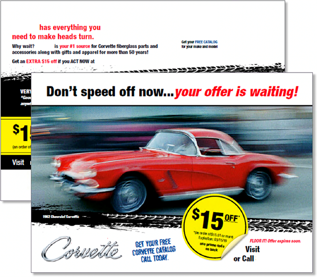
There is valuable real estate on BOTH sides of the card that can and should be used to communicate your brand and product’s story and advantage.
PRO TIP
You may have noticed that the US Postal Service delivers your mail with the address and barcode side “face up” on all pieces. This is a result of how all mailers must flow through the USPS’ high-speed sorting machines to not cause problems. This means that the mailing side is what most prospects will likely see first – so make sure that’s what you intend.
And make sure that BOTH sides of the Postcard design engage the reader, and clearly tell them what to do next. That’s how to make the most of your Direct Mail Retargeting card.
Postcard Design Mistake #4 – Relying on Logic, Not Emotion in Your Copy
We consumers are not as savvy as we think.
We believe we’re so logical in analyzing our potential purchases… comparing features and benefits and price points, with just a sprinkling of emotional influence here and there so we don’t feel like Mr. Spock at the mall.
But that’s not quite what’s going on – or even close. Several studies show that up to 90% of our decisions are based on emotion… and we simply justify our actions with logic.
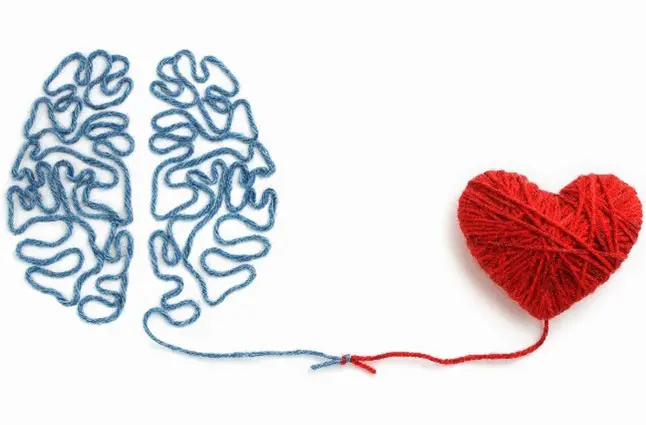
Unfortunately, most brands carry that belief into their marketing – and still rely too heavily on logic and reasoning. They arm their prospective customers with a pile of facts, specs, and feature/benefit bullets to logically prove that their product is the best…
…while 90% of their audience is wandering around, looking for any brand to help them understand how great they’ll FEEL if they buy their product.
EMOTIONAL TRIGGERS
Instead, brands need to begin learning how to identify the right “emotional triggers” that naturally pair up with their products and can evoke the type of strong feelings among their audience that moves them to take action.
Below are the 10 most common and effective emotional triggers that your brand can use to connect on a deeper level with potential customers.
Go through the list and find two or three that go well with your products or services. Brainstorm several versions for each emotional trigger, and refine it over the course of a few days – and you’ll have your core emotional messaging!
- Fear: “Don’t get caught with too little insurance.”
2. Guilt: “Don’t let them suffer anymore.”
3. Trust: “No hidden fees.”
4. Value: “If you find a better price for the same product, we’ll match it.”
5. Belonging: “You’re part of the family.”
6. Competition: “Make them drool.”
7. Instant Gratification: “Now, Today, In one hour or less, Within 24 hours.”
8. Leadership: “Be the first on your block”
9. Trend-setting: “Be like Mike”
10. Time: “Cut the time it takes to vacuum your house in half.”
Emotions are powerful, and copywriting offers a unique opportunity to tap into that power and leverage it for your business’s gain. Don’t overlook it.
Postcard Design Mistake #5 – Not Telling a Compelling Story (the RIGHT way)
While we’re on the topic of emotions…
One of the easiest ways to get emotions infused into your marketing message is through storytelling. Stories are a natural way of presenting thoughts and ideas through situations that everyone identifies with.
And the beauty for businesses about the story framework is that stories are multiple times more memorable than facts – up to 22x more, in fact.
Everyone loves a good story – so invite your customers to believe in what you believe.
“The goal is to do business with people who believe what you believe.”
–Simon Sinek
Your brand is NOT the hero… your CUSTOMER is.
Recall that what people really care about is their OWN story. When your brand stops playing the hero and starts playing the role of mentor or guide in your customer’s story, you’ll see dramatically improved results.
STORYTELLING FRAMEWORKS WORK
There are many storytelling frameworks you can use to build your brand story, but a simple yet effective one that works well with a Postcard design is as follows:

Think of your last email, social media post or mailer and see if you can identify the above elements in your collateral. Did you follow the story framework?
If not, the lack of a familiar and easy-to-understand story framework likely confused your prospects on some aspect of your offering and caused them to not buy.
Because a confused mind never buys. Clarity is key.
Story structures are the fastest and most effective way to engage your customers with an authentic message, so integrate them into all aspects of your marketing – especially your Direct Mail Retargeting design.
It takes some work, but it’s worth it.
BONUS – Postcard Design Guide
And there you have the 5 Biggest Mistakes of Postcard Design for Direct Mail Retargeting and Customer Acquisition.
Now that your mind has a good idea of the Postcard design “Don’ts”…
…how about a good list of design “Do’s”?
Click the button to receive your Design Guide, complete with a…
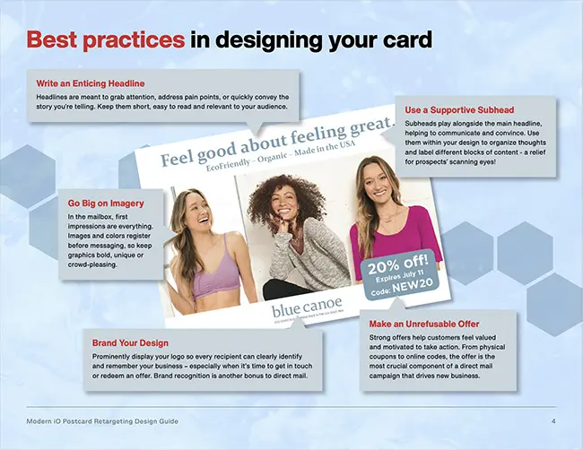
- Detailed diagram of an actual Postcard design with the call-outs of all 10 Best Practices, taken from one of our very successful Direct Mail Retargeting programs that has been generating a great ROI for over two years
- Postal Guidelines page that provides clear guidance on how to lay out your Postcards to ensure they fly through the US Postal Service without problems
- Downloadable InDesign Postcard Template that comes ready-made with all of 10 Best Practices elements to get your design moving. Personalize it, rearrange it, add your own creative flair with your choice of fonts, colors, logos and brand messaging.
Download the Design Guide now so your next design is primed for performance success.
If you need to keep advertising but want to give your digitally fatigued customers and prospects what they want – a retargeting experience OUTSIDE of their computer screens…
…then click here to choose a time to speak with the head of our Customer Success team to discover how Direct Mail Retargeting can help you make customers happy AND get double the retargeting conversions.


