Choosing Color in Direct Mail Design: Red Edition
When holiday marketing season is in full swing, the color red is unavoidable. It presents its bold hues in seasonal headlines, enticing sales and offers, party invitations and more. But how does red affect your non-holiday marketing designs? Take a dive into the fascinating psychology behind color: red edition.
In direct mail design, the words used in your copy can sometimes matter less than the color used to display the message. Colors convey mood, tone and generate physiological reactions, often at the subconscious level. That means the colors you choose for your text, imagery and other design features start talking before prospects begin reading your marketing message.

The color red may seem a little contradictory, as it can invoke a variety of feelings, including passion, aggression, danger and energy. Summoning such a wide range of emotions, red can be a difficult color to use effectively. However, it is definitely a color you should try incorporating into your direct mail designs, when appropriate. Red demands action, making it an ideal color to advertise sales or give your call to action extra life. Like orange, red draws the eye, but it adds an extra level of urgency. Orange may inspire action, but red tells your audience to take action immediately!
In addition to the mood and psychological effects of the color red, there are also a range of physical effects. When you see red, according to Color Psychology, you might experience:
- Enhanced metabolism
- Increased respiration
- Higher blood pressure
All of these effects happen because red is the color of danger or action. A softer red tone might also be an indicator of love, desire, affection or passion. The warmth of the color red is an instant mood lift for many people.
The BBC recently reported on the direct effects of red. A study on the 2004 Olympic Games found that athletes were more likely to win if they wore red. Another study on soccer disclosed the fact that penalty shooters were less likely to score if the goalie wore red. The choice of uniform color can directly impact outcomes on the sports field. It can do the same with your direct marketing, impacting customer engagement with your designs.
The Color Psychology of Red
- Red is a sign of dominance or aggression, making it a good choice for competitive venues
- Red draws immediate attention, which is why it is used for things like stop signs and stop lights
- Energy, passion and warmth are all associated with the color red
- Life and death are also linked to red
- Consider common uses of the color: seeing red, apple red, paint the town red, red-light district, red light, rose red
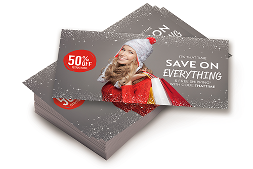
When used with a neutral background, red can help highlight a single element. The trick is not to overuse the color. Too much red can lead to a negative response, causing visual strain and giving recipients an aversion to your mailing.
Use red to highlight and draw attention to important design features. Circle your call to action in red, use a pop of red to draw attention to a sale offer, or use a red background to generate action and energy. Red is also used heavily to advertise certain holiday sales around Valentine’s Day and Christmas. For holiday mailings, you can up your red quota significantly, as your audience is likely to be more receptive. Whatever colors you choose in your marketing print projects or direct mail campaigns, be sure to do some research, especially when reaching out to segmented audiences based on culture, religion, race or other key demographics.
Call a Direct Marketing Specialist at 800.959.8365.


