Design Trends for 2016
Ahh, the New Year: new Best Of reports, new bold predictions and a seasonal time for both reflection and looking ahead. In our world of marketing, there are clear trends that come and go, with a first-mover and Johnny-come-lately. In 2016, the design and creative trends are falling in line with fashion, where old styles are re-invented in new ways, and technology drives innovative design decisions.
- Goin’ old-timey
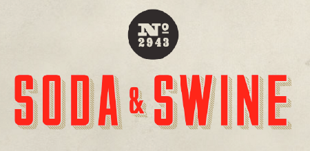
Like hipsters sporting suspenders, sideburns and mustachios, old-time graphics are making a comeback in fresh new ways. One of my favorite cocktail lounges, Polite Provisions, is part of a restaurant group that sports this entire aesthetic:
Image source: sodaandswine.com
Even the bartenders are hipsters…
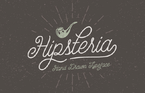
Heck, there’s even a new typeface called…wait for it…Hipsteria.
See more about hipster design from creativemarket.com
- Design for small spaces
The smartphone will now create new style guides and limitations for how designers convey information. Economy of space, clarity of font type, and a compelling transformation of logos and imagery will be needed to fit onto that inky-dink device (or, if you have an Apple Watch, inkier and dinkier).
Image source: nextpowerup.com - Color like you mean it
Ahh, we wait with baited breath to learn about this year’s Color of The Year. Right? Bueller? Anyway, Pantone releases color trends that actually inform New York fashion designers, fabric makers and an entire industry. Given the global anxiety of terrorism and public efforts to transcend different cultures toward world-wide peace, the new 2016 Pantone Fashion Color Report can be seen at pantone.com. - Customizable fonts
Heck, if Apple can make a font, can I make one too? Like Isaac Newton needed to create calculus to fulfill his physics equations, Apple launched its new typeface, San Francisco, in part to better accommodate its smaller devices, including the Apple Watch. If you know how to translate a branding strategy into evocative fonts, there are new tools out there to design your next typeface. Some of my favorites are prototypo.com and fontark.com. - Tell stories quickly
The studies have clearly shown that a video length of 90 seconds is tops for any kind of quick educational message. 30 seconds max for promotions. Longer videos are okay for a deep dive of information, but the general gist is that your message has less time than ever to sink in. Pre-roll video, banner ads and mobile ads need to get your attention and communicate a single message more quickly. That means you need to focus more intently on the clarity and focus of your message.
By Christopher Foster, VP Business Development, Modern Postcard
Call a Direct Marketing Specialist at 800.959.8365.


