How to Make a Business Flyer Catchy
Business flyers are an easy and affordable way to get your business noticed and remembered. Compared to digital ads and other online channels such as email or social media marketing, the long-lasting shelf life of print marketing is unmistakable. In this article we’re going to specifically look at how to make your business flyer stand out.
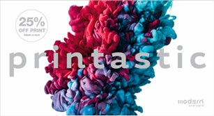
Colors – This may seem obvious. But, even if you have a strong corporate identity and your branding is always spot on, you can always find creative ways to play with color options and still be on-brand. Some brands that are famous for playing with their color scheme but are never off-brand are Absolut Vodka, FedEx, and Apple. Now, you don’t have to be a huge brand to be able to get away with this. For your own company, try business flyers as an affordable and marketable way to differentiate your brand’s services or product lines by using different color schemes for each offering.
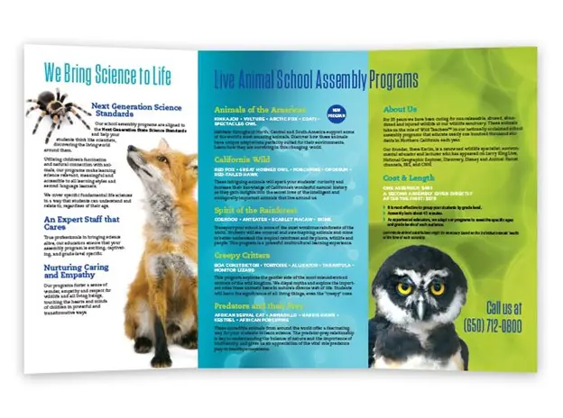
Speaking of colors, below is a great example of how Wildmind used their corporate colors to tie in its website with their business flyer:

Copy – Don’t underestimate the power of great copy. However, be warned that great copy doesn’t mean a lot of copy. You can apply catchy headlines using just a word or a few phrases. Perhaps try a peculiar question to draw attention, or use words that will make people stop, wonder and read on. Easy to digest copy in combination with a complementary design is extremely efficient and effective.


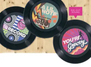
Design – One way to absolutely make your business flyers stand out is through great design. We’ve mentioned colors and copy, but we’d like to push your imagination even further by introducing the idea of die-cuts. Flyers that incorporate die-cut are interactive and have a long staying power due to their unexpected nature. You may think die-cut is for fancy birthday cards where the cake pops up when someone opens the card, but just imagine what this technology can do for business flyers and the impression it may leave on a potential customer. The amount of time, attention, and care a brand puts into their collateral is a direct reflection of how they feel about their audience.


Message – This is different than copy. One way to really make your flyer catchy is to know what you want to say, and not go off script. In other words, keep the focus (title) of your flyer to one main theme and use the general copy to drive home, or support, that same theme. A business flyer should never confuse the customer. Rather, it should explain and convey a clear message and answer relevant questions. Our in-house marketing specialists are particularly fond of bullet points when using flyers. They are a quick and easy way to draw attention to the main points without having to read multiple paragraphs.
Business Flyer Templates
The easiest way to make your business flyer look professional is to of course hire a professional designer. Modern Postcard offers direct mail templates and design services that are affordable, but if you have the inclination and some extra time to dedicate to designing your own flyer, then you may take advantage of several (free!) online design tools that offer professional and easy-to-use (think cut-and-paste) templates that will make your DIY business flyer project a breeze. We suggest looking at Canva and Adobe Express.
Background for Business Flyers
Perhaps the first thing someone sees when looking at a flyer is its title, but there’s a surprising element – the background – that stands out from the rest. It’s important to pay extra attention to the background as it can really make or break a business flyer. On one hand, if your business flyer background is too busy then the copy might be very difficult to read, but on the other hand, if it’s too plain the flyer might never catch anyone’s attention.
Picking a background might seem daunting as it sets the tone for the piece itself, however, when in doubt we typically recommend choosing something simple with a subtle design element using your brand’s colors. Again, using Canva or Adobe Spark will facilitate greatly in making this decision much easier, but if you’re still concerned about picking the right background for your business flyer, Modern’s in-house designers are here to help. Contact us today at 800.959.8365 and get the conversation started.
At the end of the day, keep in mind that the purpose of the business flyer is to advertise your business, and who knows your business better that you? That’s right, no one. You got this! Now, let’s take a look at what should go inside your flyer.
Tip! Before you start planning out your layout, design and copy, remember to save space for your business card. After all, never miss an opportunity to share your personal contact information! Business cards and flyers go hand-in-hand by simply adding business card slits inside the flyer to secure your card.
What Should a Business Flyer Include?

Designing a flyer is a great opportunity to have fun with your creativity, but there are some things we recommend should always be included, such as your logo. This may sound obvious, but you’d be surprised to know how many times the logo is omitted, or placed in an obscure spot, or made too small where it’s impossible to decipher. Make sure to place your logo on the front of the flyer and give it some space to breathe.
A business flyer should also include your company name and contact info (must include at least a phone number and a website url), headline, subhead if appropriate, short paragraphs, bullet points if applicable, eye-catching product or service images, an offer such as a discount, BOGO, or coupon code, and a clear call to action, i.e.: contact us for more information.
When designing a business flyer, it’s easy to get lost in the details of what your business has to offer, and understandably so – you’re proud of what you and your team have accomplished – but for the purpose of creating a business flyer, as previously mentioned, always remember to stay on topic, provide details on how your customers benefit from your product or service, and focus on a single call to action. If however, you find it too hard to overlook information that may be off-topic, try to include those tidbits in a dedicated FAQ section. This will allow you to stray from the main message and incorporate other business undertakings without muddling the main theme of your flyer.
We have found that many of our clients use this tactic to promote other services or business capabilities that may have otherwise not been applicable to mention, but the FAQ section gives room to do just that – without seeming desperate. Every flyer has to strike a certain balance of just enough information, i.e. copy, coupled with the right amount of images, along with other design elements such as infographics or abstract designs.
Tip! If the intention of your flyer is to bring people to your website, an easy and effective way to do so it by including a QR code. There are numerous tools you can use to generate a QR code, such as Beaconstac or QR Code Monkey.
In order to make your business flyer professional, keep it clutter-free, incorporate your brand color(s), and use an easy-to-read font like Helvetica, Arial or Calibri. Try to keep your paragraph font size the same throughout your flyer and try not to italicize or “all cap” too much, if at all. Remember, clean and clear is the way to go!
How Will You Make Your Flyer Stand Out in the Crowd?
We’ve touched on colors, copy, design and message. However, if you’re looking to have your business flyer stand out from the crowd, you might want to take a look at different size options, as well as different format options. Die-cuts, as we’ve already mentioned, will of course stand out because of their irregular shapes. Large business flyers will also stand out because of their size, but so will smaller, square-shaped flyers. Choose whatever option is best for the message you want to promote.
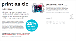
Tip! A fun way to stand out from the crowd is to add texture, spot coating or foil to the cover of your business flyer. Foiling your flyer’s title or your company’s logo adds an element of interaction and gives your piece a leg up when it comes to attracting attention.
Other ways to make your business flyer text stand out is to use creative fonts. However, limit these creative fonts to one style and use it consistently throughout your flyer for one purpose only, i.e.: headlines, special call-outs, taglines, offer codes, etc.
Perhaps more important than anything else, at the end of the day your business flyer will not stand out because of one thing alone, but rather for the overall approach in its design, message, and purpose.
Amplify your business with Modern Postcard!
Call a Direct Marketing Specialist at 800.959.8365


