Design Best-Practices
So you get a better response with your design,
we’ve outlined best-practices.
There’s an art and a science to direct mail responsive design, and we have learned what works and what doesn’t. These guides can help you prepare your upcoming mail pieces.


“Armando and Chris always pay close attention to everything about my catalogs and mailers. Their responsiveness and fast turnaround really matter to me, and my business.”
Pauline Nakios, Owner, Lilla P. | Customer since August 2001
Call to Action Content that’s Clear
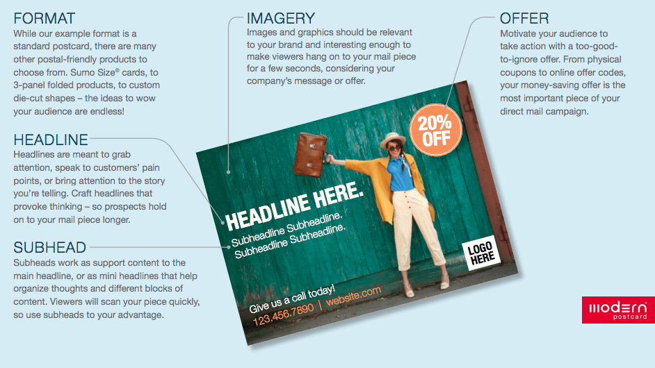
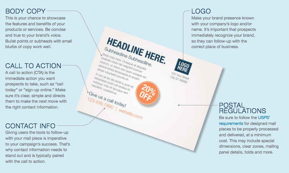
In direct marketing, a call to action (CTA) is an instruction on your mail piece that directs prospects to take the next step. Whether it requests they make a phone call, redeem an online offer code or set up an appointment – there’s an art to creating a successful CTA. Make sure it’s clear and simple, such as “call [phone number] to cash-in on your offer by [deadline]” or “visit [web URL] to sign-up for your [offer].” Also, try adding an expiration date to create a sense of urgency.
Call to Action Design for Impact
The CTA should visually jump out from your mail piece, whether it’s inside a bright-colored callout, has an arrow pointing to it, or takes up prime design real estate. We recommend your CTA be listed twice on your mailer: once on the front and once on the back (or exterior/ interior). If your mail piece needs to be opened or flipped through like a booklet, you can entice prospects to do so with creative front-side callouts like “peek inside for amazing discounts.” Use a typeface that’s legible and larger than the body copy, so it’s easily recognized as important content.
Compelling images and graphics draw more attention than a blank or boring background. Ask yourself, ‘Will people want to view this design for more than two seconds or even save it for later?’ If the answer is a flat-out no, you probably haven’t hit the mark. Find the balance between shocking and safe with visuals that are relevant to your brand and interesting enough to make prospects consider your offer.
When choosing typography, less is more. It’s typical for professional designers to choose two different complementary fonts per piece: one for headlines, one for body copy. Too many styles or hard-to-read fonts often make your marketing piece look cluttered and amateur. Stick with a clean design and consistent font use to look like a marketing guru.
Violators that Get Attention
In direct mail design, violators are a good thing. They are graphical elements that disrupt prospects’ scanning eyes from the body copy and strategically guide them to your promotional offer. For example, a snipe is a callout placed in the corner of a mail piece that entices viewers to turn the page and see an inside or backside offer. Other violators include: arrows, boxes, circles, bursts, banners and other creative features that distract and demand attention.
You’ve heard this before, but truly sticking to it can be a challenge. Avoid using ten-dollar words when two-dollar words will do. Keep your design easy to understand and approachable. If it gets overly complicated with too many messages, transform it into a three or five-piece campaign, with each piece focusing on a single concept. In the end, it’s better to engage your customer base multiple times with a strategic campaign, than to jam-pack multiple concepts into a single marketing piece.
When you add stylistic features to your mail piece, develop a plan of hierarchy and consistency. Define colors, fonts and type sizes for headlines, body copy and callouts, then stick with them! For example, if your headlines are displayed in purple lowercase typography, that’s fine. What really matters is, every headline should follow along so it looks like your design decisions are consistent and intentional. Too many creative elements confuse the reader and limit response.
Coupons to Lift Response
Nothing implies immediate savings quite like a coupon does, so incorporating a detachable voucher or simulated coupon component in your mail piece can lead to better response. For brick- and-mortar businesses, tear-off coupons or “bring this card to redeem offer” callouts are excellent for in-store redemption. Online businesses can include a unique offer code with corresponding webpage and expiration date to motivate buyers. When designing online-only offers for physical marketing pieces, circular callouts, dashed lines, colored boxes and other shapes help emulate a coupon and grab attention without creating a tangible tear-off.
Design that Matches your Audience
Messaging, color choice, layout and image selection should all be thoughtfully chosen in a way that’s suited to your target audience. This goes well beyond male versus female. It could mean designing to certain professions, income brackets, ethnicities, locations and so much more. Whatever it is you’re selling, you must know who you’re selling to and how you can best relate to them through your direct marketing efforts. Personalized mail with Variable Data Printing can also be a helpful tool to build relevance with a special audience.
FREE Direct Mail Seminar
Live in NYC, May 20: Discover how top brands are using direct mail to drive better ROI and cut acquisition costs.
FREE Marketing Kit
Gain insider tips and expertise that will help you launch effective direct marketing campaigns.

