
Choosing Color in Direct Mail Design: Grayscale Edition
With plenty of gray skies, wintry white snow days and the somber feelings that can come after the highs of the holidays, January sets the mood for the next edition of our popular color series – or in this case, we’ll call it a lack of color series. Shades of black, gray and white can have a simple yet serious sway not only in print design, but digital too. We’ll explore how they create negative and positive space that can help add visual interest to your messaging and marketing efforts.
Black gives off power, strength and prestige. Its origins can express death, evil and mystery, but this deep shade also signifies elegance and formality, like a black-tie affair. In marketing, black is often represented in a confident light to make a sleek statement, or to communicate something serious. One interior design tip is to feature a single black piece of décor per room, as it adds a sense of stability, rest and balance to a living space. From designer cars and retail collections to everyday staples, black helps elevate products so they appear more luxurious.
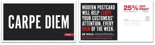
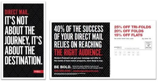
In 2017, our marketing team crafted the “Be Bold” campaign, which featured primarily grayscale graphics with pops of red to highlight our logo, offer and call to action. Black and white was the perfect, newsworthy palette to showcase cool typography and clever messaging while also grabbing the attention of our audience. Most of our direct mail campaigns are colorful or showcase photography, so this marketing series was a nice – yet impactful – breather for our customers and prospects. Email and social media artwork was also designed to tie into this same concept. You can view a few samples below.
White brightly stands as the opposite value of black, but it is not an exact opposite in terms of the response it can draw from your target audience. It often brings to mind cleanliness, purity or peace. White makes spaces feel more open, and it’s common for marketers to request more whitespace from graphic designers, to help creative pieces be more easily digestible by customers and prospects.
The book series, “50 Shades of Grey,” may come to mind first, but in terms of color, there are literally hundreds (if not more) shades of gray in the spectrum. From warm grays to cool grays, this tone can evoke anything from depression to sophistication, all depending on how it is used in your direct mail campaigns and print collateral. A few years ago, gray became the go-to for marketing design, interior spaces, product packaging and more. While it’s getting a bit tired in interior spaces, it is still a wise choice for print and digital design, especially when you need a darker tone that is less harsh than black, but still very neutral. For example, sometimes our marketing team will choose a dark charcoal over a true black, because it is slightly less intense.
Some of the most prestigious brands out there – think Apple, Calvin Klein, etc. – have produced entirely white, black and gray marketing materials. Why? Because the goal with every direct mail campaign is to stand out from the crowd. If everyone else in your niche is using color, it might pay to consider a more traditional palette for your next piece.
Grayscale Design Tips
- Black and white photography is considered its own art form and can make a striking visual impact. Give it some contrast with colorful headlines, sales offers or your call to action.
- Black type is common because it reads well on most background colors, making it the ideal choice for virtually any print job.
- Consider using a single color in a sea of black for an evocative look that draws attention to your brand or primary messaging.
- Whitespace is necessary in design to help give your viewers’ eyes some rest, or to help them more easily navigate through your graphics and messaging. If your design is mostly dark tones, white can be used to make important information pop off the page.
- Adding color to a print job can also add to the total cost, so if you’re on a tight budget, grayscale pieces can work as long as they feature bold typography, stand-out messaging and interesting visuals.
- Black is a harsh and heavy color, and white can be equally difficult to read when it is overpowering. Combining these colors with gray or other tones helps reduce the amount of visual strain your audience can experience.
- If you have a text-heavy mailer, you can use gray to break up text with carefully placed dividers, bullet points or other text that is already highlighted. This cooler shade appears more relaxed when placed against the authority of the black text or the pristine white often used as a background.
Want to learn how to use black, white and gray to help your mailings pop in the right way? The experts at Modern can help you launch quality, customized promotions that get results for your business.
By Jessica Biondo, Marketing Communications Manager, Modern Postcard
Call a Direct Marketing Specialist at 800.959.8365.